A well-designed logo is more than just an identifier—it’s the face of your brand, the first touchpoint that shapes how potential customers perceive you.
Think instantly about the logos you recognize: Apple’s sleek silhouette, McDonald’s golden arches, or the clean and straightforward Nike swoosh. These logos have transcended the products they represent and become cultural icons in their own right.
But what makes a logo genuinely great? What transforms it from a simple design into a robust brand recognition and loyalty tool? A great logo also tells a brand's story, effectively communicating the essence of the brand and making it memorable.
At Asymmetric Marketing, we’ve designed logos for businesses across industries and seen firsthand the impact a thoughtfully crafted logo can have. In this guide, we’ll dive deep into the key elements of successful logo design, the psychology behind effective logos, and the step-by-step process for creating a memorable, versatile, and timeless logo.
The Key Elements of a Great Logo
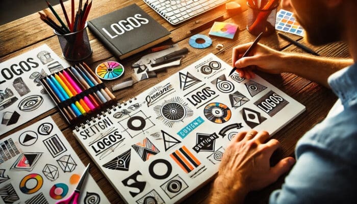
Every successful logo is a balanced mix of art, strategy, and design elements. Let’s explore the core elements that make a logo not just good but great:
Memorable
At its core, a logo needs to be memorable. The simpler and more distinctive it is, the easier it is for people to remember.
Think about it: You don’t need to read the company name when you see Apple's logo—you already know what it represents. That’s the power of a memorable logo.
Your logo should capture attention and leave an imprint on your audience's minds. Its visual shorthand will help people remember your brand long after seeing it.
Versatile
A great logo must work across different mediums, platforms, and sizes.
It must look as sharp on a business card as on a billboard. Your logo should also be flexible enough to be rendered in color and black-and-white formats without losing its essence.
Test your design across multiple platforms, including social media profiles, mobile screens, and printed materials, to ensure its integrity in all situations.
Timeless
Like any other design element, logos can fall prey to fleeting trends.
What looks fresh and innovative today might seem outdated in just a few years. A timeless logo avoids design fads and is built on solid, lasting principles.
Think Coca-Cola’s flowing script or IBM’s simple, bold typeface—these logos are just as relevant today as they were decades ago.
Timelessness in design ensures that your logo will remain influential and recognizable even as design trends evolve.
Appropriate
Your logo should resonate with your target audience and align with your brand's personality.
For instance, a tech startup might opt for a clean, minimalist design to reflect innovation and modernity. At the same time, a luxury brand would likely go for a more intricate or elegant logo to evoke prestige and quality.
When designing your logo, consider your industry, audience, and brand values. There should be a clear connection between your business and its visual identity.
Simple
Simplicity is the ultimate sophistication in logo design.
The most effective logos are simple yet powerful.
They don’t clutter the design with unnecessary details or complexity, making them easier to recognize and remember. Google’s multicolored wordmark or Target’s bullseye are perfect examples of how simplicity can create impact.
A simple logo is more straightforward to reproduce, works well across various platforms, and doesn’t rely on trends to remain effective.
Understanding the Psychology of Logo Design and Brand Identity
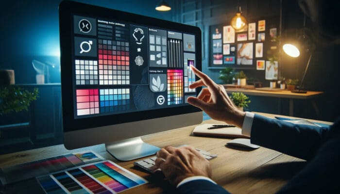
Behind every great logo is a deep understanding of psychology.
Colors, shapes, and fonts each communicate different messages and emotions, often subconsciously. By leveraging this knowledge, you can design a logo that resonates with your audience on a deeper level.
Color Psychology
Color is one of the first things people notice about your logo. It conveys emotions and associations even before a single word is read. Here’s a breakdown of what different colors generally signify:
- Blue: Trust, professionalism, and reliability. Financial institutions like Chase and PayPal often use it to create a sense of security.
- Red: Excitement, passion, and urgency. Brands like Coca-Cola and Netflix use red to stimulate emotions and grab attention.
- Green symbolizes health, nature, and tranquility. Companies like Whole Foods and Starbucks use green to convey environmental consciousness and relaxation.
- Yellow: Optimism, warmth, and energy. Think of McDonald’s cheerful golden arches or Snapchat’s playful icon.
Choosing the right color palette is essential for aligning your logo with your brand values and the emotions you want to evoke in your audience.
The Power of Shapes
Shapes in logo design also have psychological implications. Different shapes can evoke various feelings:
- Circles: Represent unity, community, and perfection. Circular logos often feel friendly and approachable (think Pepsi or Spotify).
- Squares and Rectangles: Convey strength, stability, and professionalism. Many tech and financial firms use angular shapes to project authority and reliability (like Microsoft or the BBC).
- Triangles: Suggest power, direction, and movement. They are dynamic and can represent progress and ambition (like Adidas or Mitsubishi).
By carefully selecting the shapes in your logo, you can subtly guide how people perceive your brand.
Typography and Fonts
Fonts play a critical role in logo design. Serif fonts, which have little "feet" on the ends of the letters, feel traditional and reliable (think Time Magazine or The New York Times).
In contrast, sans-serif fonts, which don’t have those feet, feel modern and clean (think Google or Nike).
You can also use typography to add personality to your brand. Script fonts convey elegance and creativity, while bold, blocky fonts are seen as confident and strong.
The font you choose should reinforce the message and tone of your brand.
The Logo Design Process: Step-by-Step Guide to the Design Process
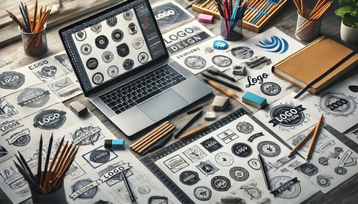
Creating a successful logo requires a strategic process, balancing creativity with clarity of purpose. Here’s how we approach logo design at Asymmetric Marketing:
Step 1: Brand Discovery
Before any design work begins, you must understand your brand inside and out. Who are you?
What do you stand for?
What sets you apart from your competitors?
Your logo should visually represent your brand’s core values and mission.
Conduct a thorough brand audit to define these critical elements before diving into design concepts. Creating a comprehensive brand kit can help compile these elements and establish a cohesive identity for your startup.
Step 2: Research the Competition
Next, look at what’s happening in your industry.
What are your competitors’ logos like?
Are there specific design trends or colors they tend to use?
While fitting into your industry’s landscape is essential, your goal should be to create something unique that sets you apart.
Step 3: Brainstorm and Sketch
Now comes the fun part—brainstorming and sketching.
This is the creative stage, where no idea is too far-fetched. Play with different concepts, layouts, and symbols.
Whether drawing by hand or using design software, this stage is about exploration and creativity.
Step 4: Create Digital Drafts
Once you’ve narrowed your ideas, it’s time to bring them to life digitally.
Use design tools like Adobe Illustrator, Figma, or Canva, or a logo maker to create high-quality drafts of your logo ideas.
This is where you’ll start to see how your logo looks in various formats and colors.
Step 5: Refine and Iterate
Now, it’s time to refine your custom logo.
Narrow your options to one or two strong contenders and make any necessary adjustments.
Test how they look in black-and-white, on various backgrounds, and at different sizes.
A great logo should be adaptable and work seamlessly in all contexts.
Step 6: Gather Feedback
Get feedback from key stakeholders and even potential customers.
Fresh eyes can provide valuable insights and highlight issues you might have overlooked.
This step ensures that your logo resonates with your target audience before it’s finalized.
Step 7: Finalize and Package
Once you’ve made your final tweaks, package your logo for all its potential uses.
Ensure you have high-resolution files in multiple formats (JPEG, PNG, SVG), and include color variations, such as a black-and-white version, to ensure it works in every scenario.
Common Logo Design Mistakes to Avoid

While a logo is meant to be timeless, there are times when it’s appropriate—and even necessary—to update it. Here are some signs it might be time to consider a logo refresh:
- Your Brand Has Evolved: If your company has shifted its mission, vision, or target audience, it may be time to adjust your logo to reflect these changes.
- The Logo Looks Outdated: If your logo was designed decades ago, it may feel stale or irrelevant. Updating your logo can modernize your brand and breathe new life into your identity.
- You’re Expanding to New Markets: If you're expanding geographically or diversifying your product line, a new logo can signal growth and appeal to a broader audience.
Conclusion: Crafting a Logo That Works for Your Brand
A well-designed logo is one of your brand's most important investments.
It’s not just a visual element—it’s a tool that communicates your brand’s identity, values, and promises to your audience.
By following the principles of memorability, simplicity, and alignment with your brand identity, you can create a logo that not only stands out but also stands the test of time.
Frequently Asked Questions (FAQ) About Logo Design

How many colors should my logo have?
Ideally, your logo should use no more than 2-3 colors.
This keeps the design simple and memorable while ensuring it looks good across different platforms.
Too many colors can make your logo feel cluttered or difficult to reproduce in certain formats (like black-and-white).
Consider choosing colors that align with your brand values and evoke the right emotional response from your target audience.
Should I include text in my logo or use a symbol?
Both approaches can work, depending on your brand’s needs.
Some logos (like Nike’s swoosh) are purely symbolic, while others (like Coca-Cola’s script) rely heavily on text.
Many brands opt for a combination, where the symbol stands alone in some contexts and is paired with text in others.
Ultimately, the decision should depend on the uniqueness of your name and the strength of the symbol you choose.
What’s the difference between a logo and a brand?
A logo is a visual representation of your brand, but it’s only one part of your overall brand identity.
Your brand encompasses your company’s values, mission, messaging, customer experience, and reputation.
The logo serves as a quick visual reminder of those more profound brand attributes, which is why it’s essential for it to align with your overall brand strategy.
How often should I update my logo?
There’s no set rule for how often you should refresh your logo.
If your logo looks outdated or no longer reflects your brand’s direction, it may be time for a refresh.
Some brands, like Google, opt for minor, evolutionary updates over time, while others, like Instagram, have undergone more drastic rebranding.
The key is to ensure that any change you make enhances your brand rather than alienating your existing audience.
Q: What file formats should I have for my logo?
Having your logo in several file formats is essential to ensure it can be used across different mediums.
At a minimum, you’ll need a vector file (such as .AI or .SVG) for scaling without losing quality, as well as raster files like .PNG (for web use with transparency) and .JPEG (for general image use).
It would help if you also had color variations (full color, black, white) for different applications.
Can I design my logo, or should I hire a professional?
While designing your own logo using DIY tools can be tempting, it requires a deep understanding of design principles, brand strategy, and market psychology.
A professional designer can ensure your logo aligns with your business goals and resonates with your target audience.
Investing in professional design is often worth it, as your logo will be one of your brand identity’s most visible and enduring aspects.

Ready for Logo Design Consulting for Your Perfect Logo?
Let us help you create a stunning logo that works hard for your brand.
- Book a Consultation: Get personalized advice on how to design a logo that truly represents your brand. Book now
- Stay Updated: Subscribe to our newsletter for more tips and insights on branding, design, and marketing. Sign up here
About the author
Mark A. Hope is the co-founder and Partner at Asymmetric Marketing, an innovative agency dedicated to creating high-performance sales and marketing systems, campaigns, processes, and strategies tailored for small businesses. With extensive experience spanning various industries, Asymmetric Marketing excels in delivering customized solutions that drive growth and success. If you’re looking to implement the strategies discussed in this article or need expert guidance on enhancing your marketing efforts, Mark is here to help. Contact him at 608-410-4450 or via email at mark.hope@asymmetric.pro.
