Preparing Your Home for Guests
Would you host a Thanksgiving dinner for 25 people on a moment’s notice in your house?
For most people, the answer is “absolutely not!”
Because most people understand that their house needs to be cleaned up, shopping needs to be done, and the cooking needs to start well in advance of the meal.
Yet, strangely, many people seem to think their website requires no sprucing up prior to ushering in a gusher of traffic.
Okay, that was a lot of mixed metaphors at once, but it was fun for me to picture.
What I’m saying is: most websites are a bloody mess that are in no way ready to 2x, 4x, 5x or 10x their visitors.
If they entered now, people would come, see the entryway, and leave. And you’d be out potentially thousands of dollars in ad spend.
Let me ask you this:
What percent of your website visitors convert right now?
If you don’t know that, then you have some analytics to set up and review.
Start with Google Analytics.
Set up a free account and add the tracking code to your website (or have your web person do this).
Then, customize your Google Analytics setup with your Conversion goals.
Here’s a very basic one: create a thank you page. When someone fills out the form on your site, redirect them to said thank you page. It seems simple and stupid, but this is the easiest way to track your results because it allows you to create a Google Analytics Conversion event based on a user visiting that thank you page (which they can only get to by filling our your contact form).
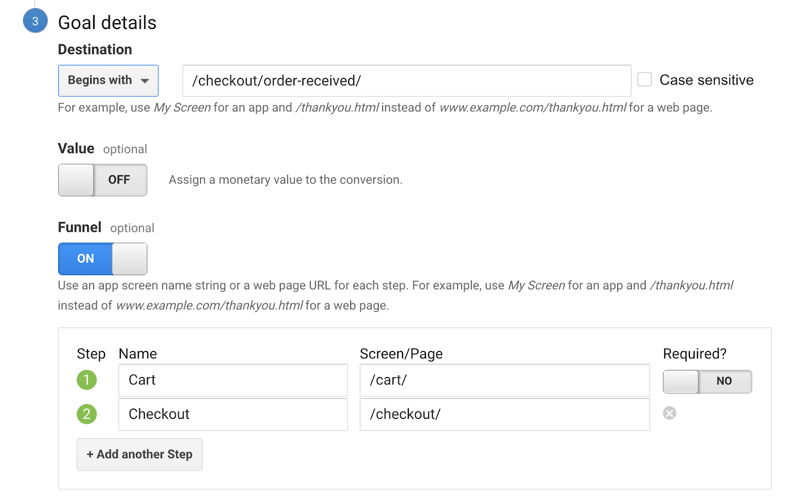
If you’re running an ecommerce store, then track the purchase thank you page, and maybe even set up a goal funnel like the one below to see where you’re losing people in your checkout process.
(Note: this setup should work if you’re using the default shopping cart setting in WordPress WooCommerce.)
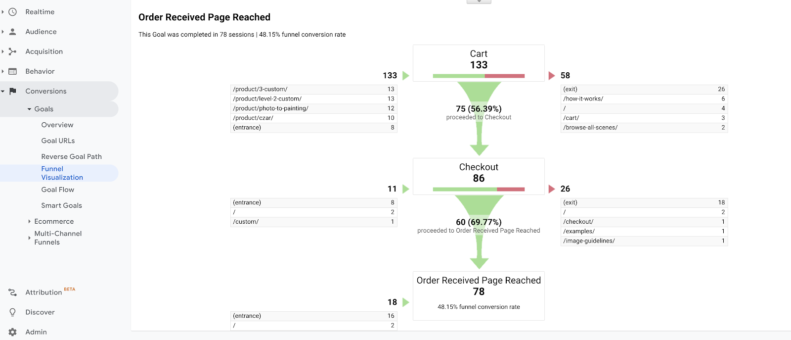
Now we can see our conversion rate. Ouch, looks like it’s around 1% for this site.

That’s not crazy, given that we’re selling products that start at $199, but it means we need 100 visitors to the website (just on average!) to get a sale.
On Facebook Ads at the time of this writing, it’s normal to pay around $1 per click (cost per click or CPC), which means I could buy 100 clicks to my site for $1 apiece, and hopefully get one sale for $100.
That would be my Cost Per Acquisition (or CPA).
If I have 50% profit margins on a $200 product, that means I only get to keep $100 of a sale as gross profit.
And that’s assuming I paid no marketing cost whatsoever.
So if I have to pay $100 to earn a sale from a new customer by buying Facebook Ads, then I’ll only break even on that sale, not make any money.
That might be okay if I know my customers buy from me more than once (and thus have a higher Lifetime Value or LTV), but if they usually only buy once, then that’s no good because I’m not in business to break even. I need to make a profit on each sale.
Hence, I may need to “spruce up my house” before I invite in guests for Thanksgiving dinner.
How to Increase Your Conversion Rate with Conversion Rate Optimization
Once you know the conversion rate of your website or even specific website pages, the process of improving it is called Conversion Rate Optimization (or CRO).
If you had a physical retail store with salespeople, then some % of the people who walked into the store would buy. You could then train your salespeople to sell a higher percentage of walk-in customers, and/or you could spruce up how the products are laid out in your store and how the experience -- of walking in, browsing, getting questions answered and buying -- flows.
If you took a hard look at that customer experience both in terms of numbers and feel, you’d likely come up with some ways to improve the customer buying experience.
The same holds true for your website and landing pages, whether you want people to buy online or contact you to set up a sales call.
In general, you increase your conversion rate by trying the following things:
- Implementing all the Rules of Thumb we covered in the Customer Persona and Copywriting section above
- Making it crystal clear at the top of each page what and who this page is for
- Reducing uncertainty or risk for the prospect and customer (what happens next? What happens if…?)
- Improving your page load times (shoot for 2-4 seconds or better, if possible)
- Improving your headlines, bullets, text, images, videos or calls to action (CTA) buttons
- Improving the way the visitor experience flows between pages and the actions they need to take on the pages
- Asking people what’s holding them back from taking action through surveys, polls, interviews, live chat, etc.
- A/B testing two versions of the same page to see which performs better (with statistical significance so you know it’s not just a fluke)
- Improving the overall look and experience of the page on different devices (desktop, mobile, tablet) and browsers (Safari, Chrome, Edge, Firefox)
Conversion Rate Optimization (CRO) is an entire specialty within digital marketing, so there’s a lot to it.
For the layman, it’s helpful to start visualizing how visitors are using your pages by setting up a heatmap and screen recording tool so you can watch how real users are interacting with your pages.
At my agency, we recommend starting with HotJar because it has an absolutely amazing free version. Like Google Analytics, all you have to do to get started is sign up for a free account and add some code to your site to start tracking.
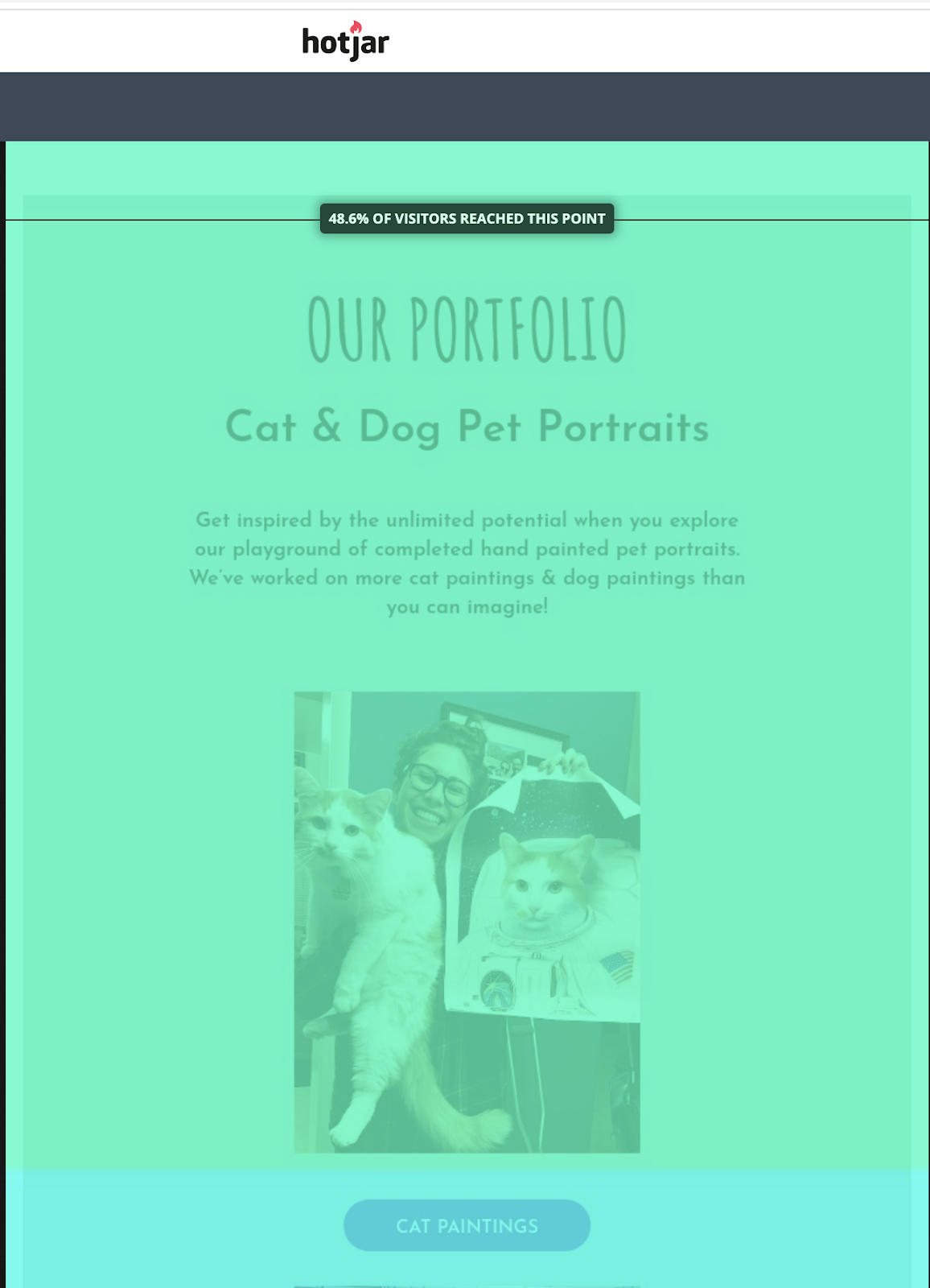
Here’s what the heatmaps looks like.
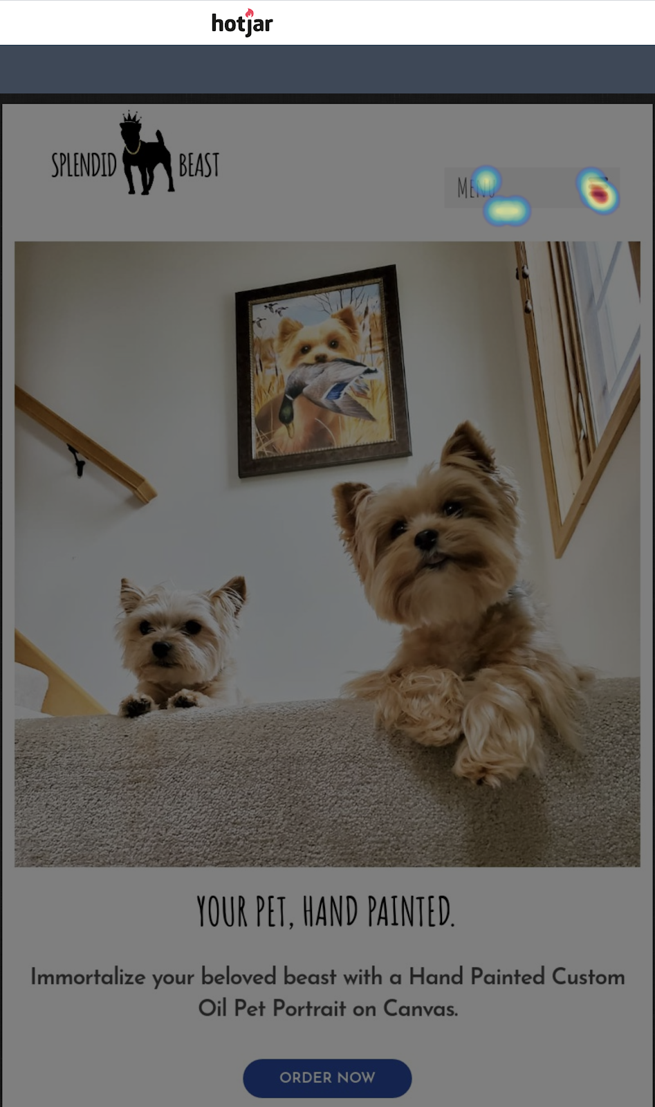
Yes, you can actually see where people click or tab (you look at desktop, tablet and mobile) and how far people actually scroll down your pages.
The recordings will have you yelling in frustration as you watch users click around your site in ways you never imagined or intended and ultimately leave without taking the actions you want them to. (For privacy, any info they enter looks like ********** on the recordings.)
It’s sobering how poorly we anticipate the needs, desires, and thoughts of others.
Welcome to marketing.
And speaking of marketing; I find that it’s prudent to learn from and mimic the very best.
There are some fantastic tools out there to help you create high-converting landing pages and even A/B test them.
Because we know they do this for a living, we can reasonably infer that they test, iterate on, and improve their own landing pages, which we can look at and learn from. Check out the LeadPages homepage. (It will likely be different by the time you read this because they improve it over time. CRO is an ongoing process.)
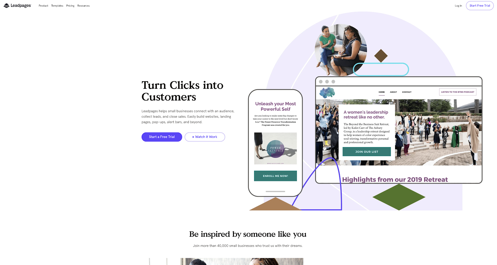
Notice the implied 1:1 communication of the main headline speaking to you, not about them:
“Turn Clicks into Customers”
The design is quite minimal on a large desktop screen. There’s a lot of white space.
The Call to Action (CTA) button jumps out in its unmistakable purple with clearly rounded edges for me to press, and it says, again addressing me as the visitor:
“Start a Free Trial”
There is little friction here. I don’t have to scroll down the page or click to another to discover what the options are for me or what I should do next.
Moreover, the offer here is risk-free in the sense that it’s FREE, which is always a great starting point.
We’ll talk more about this when we get to funnels, but in general it’s nice to have a “micro conversion” like “Download our Free Guide” to get people’s information for continued email marketing without making them feel they have to enter into an uncomfortable sales conversation they’re not ready for yet (remember traffic temperatures?).
Contrast this with the standard Contact Us page we all use with the ambiguous Submit button. What’s going to happen after I press Submit? Will I be getting a phone call (which I hate, by the way, because I’m under 40)? Will I be barraged with daily emails, voicemails, and texts?
For many service businesses “Book a Free Consult” seems like a softer touch, but it may or may not be depending on your industry. Is the jig up? Do most of your prospects actually know that Free Consult is actually a dreaded High Pressure Sales Meeting? If so, then you may need to soften further with a Free Guide that just puts people onto your email list, but you don’t call them just yet.
How about the homepage for Unbounce (another tool like LeadPages)?
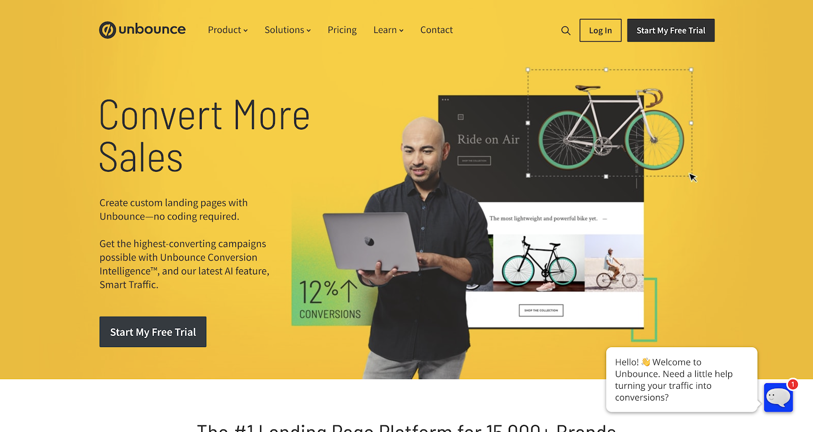
Headline: Convert More Sales
CTA: Start My Free Trial (in multiple places)
Design: Fairly minimal with text to one side and images to the other
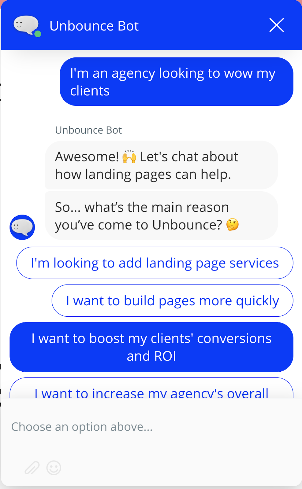
Plus: a Live Chat box in the corner asking me “Need a little help turning your traffic into conversions?”
And check out what the bot says after you click it. It’s getting you to segment yourself so they can communicate with you based on your Persona and Traffic Temperature.
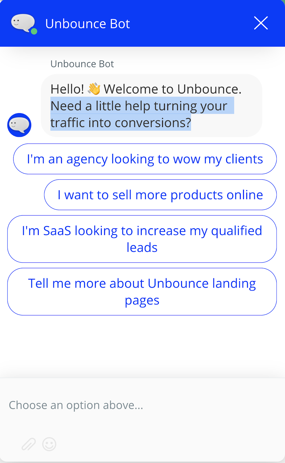
Note how the conversion continues when I select an option.
How about the ClickFunnels homepage?
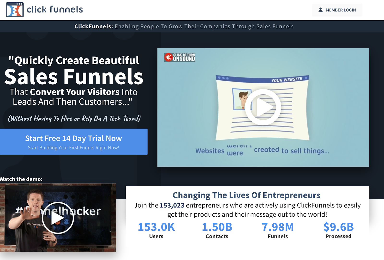
These guys have a great video, a similar headline and CTA, and social proof from other users who have gone before you and the results they’ve seen.
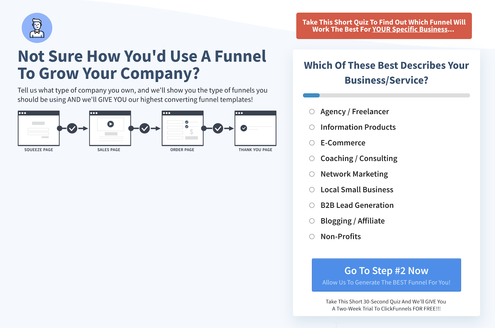
They also have this free quiz farther down the page for you to segment yourself into one of their Buyer Personas.
What This Teaches Us About Conversion Rate Optimization
I’ll stop here for now, but I hope you can see the value of learning from and copying the best.
With these landing pages, this Live Chat and this quiz, you can see how they’re automatically mimicking the 1:1 sales experience you might have in a physical retail store with a salesperson.
Color me impressed.
I have no doubts that these conversion-oriented companies tested every element of these pages, the Quiz, and the Live Chat logic tree to optimize for their main conversion action: “Sign Up for a Free Trial.”
Take a look at your own homepage. What can you do to make it more like some of the highest converting pages?
Each page should have only one goal, and should drive the prospect relentlessly and seamlessly toward it. More about this in the CRO chapter later.
About the author
Mark A. Hope is the co-founder and Partner at Asymmetric Marketing, an innovative agency dedicated to creating high-performance sales and marketing systems, campaigns, processes, and strategies tailored for small businesses. With extensive experience spanning various industries, Asymmetric Marketing excels in delivering customized solutions that drive growth and success. If you’re looking to implement the strategies discussed in this article or need expert guidance on enhancing your marketing efforts, Mark is here to help. Contact him at 608-410-4450 or via email at mark.hope@asymmetric.pro.
